HOME HARDWARE
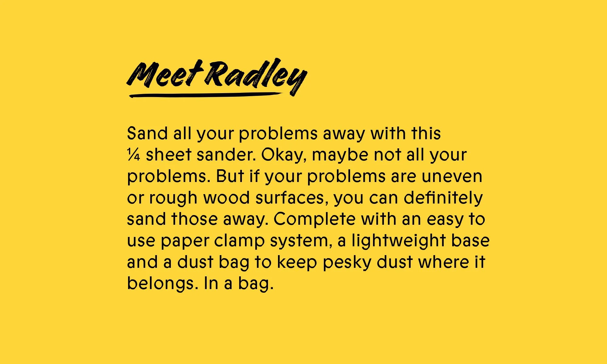
MEET RADLEY.
Together with Home Hardware, Radley was developed as a new line of power tools that stood out on shelf against the masculinity of competitors both in terms of design and the tone of voice, welcoming both first-time buyers and more experienced DIYers to bring Radley home as their project partner.
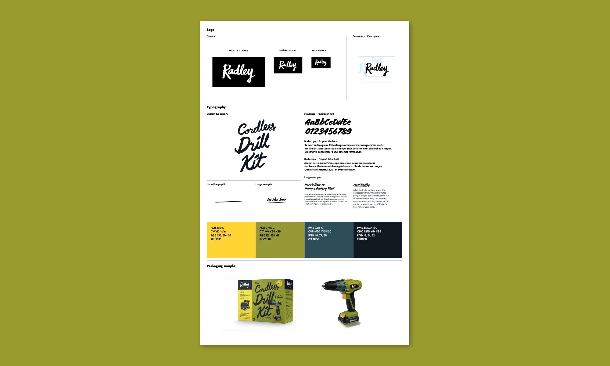
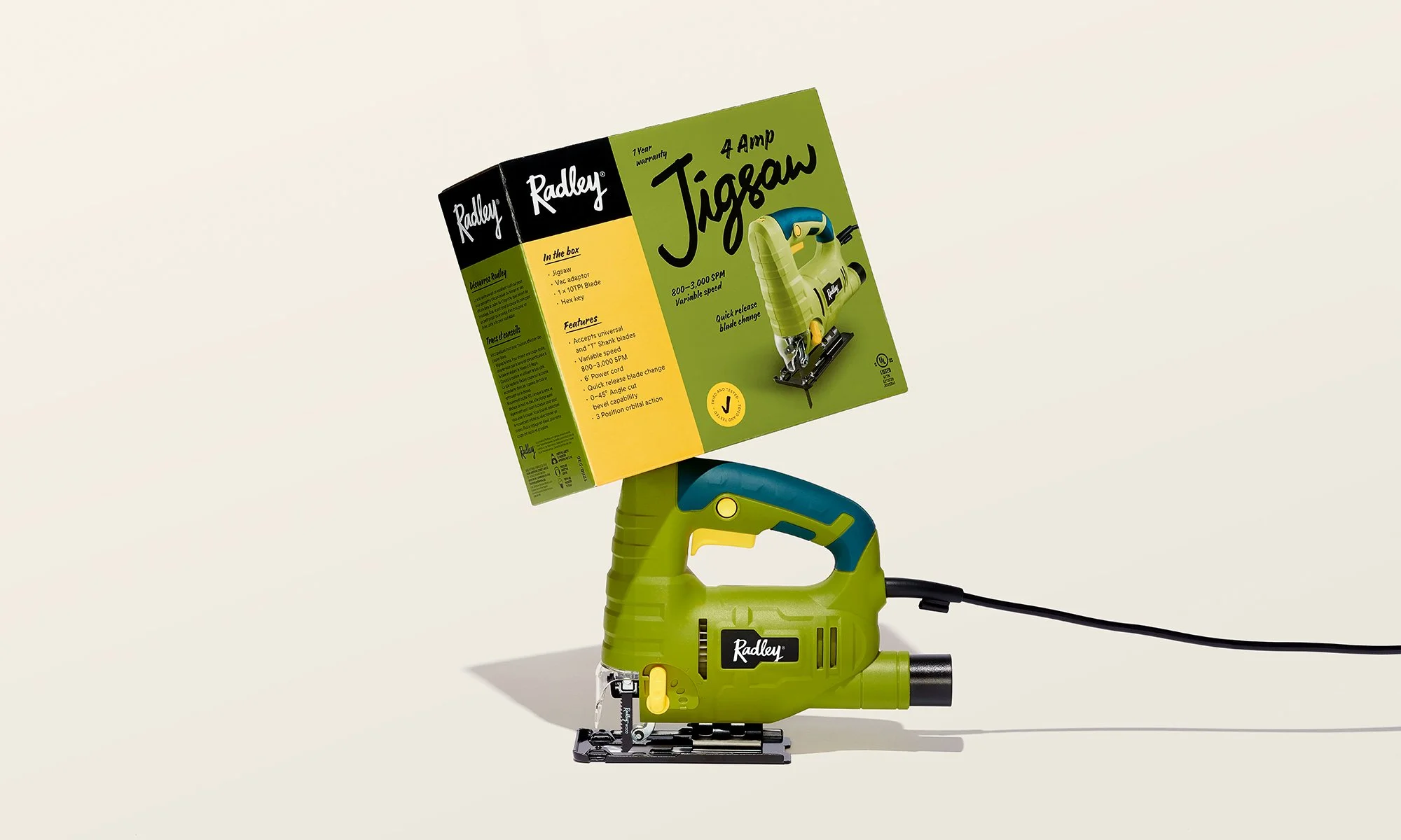
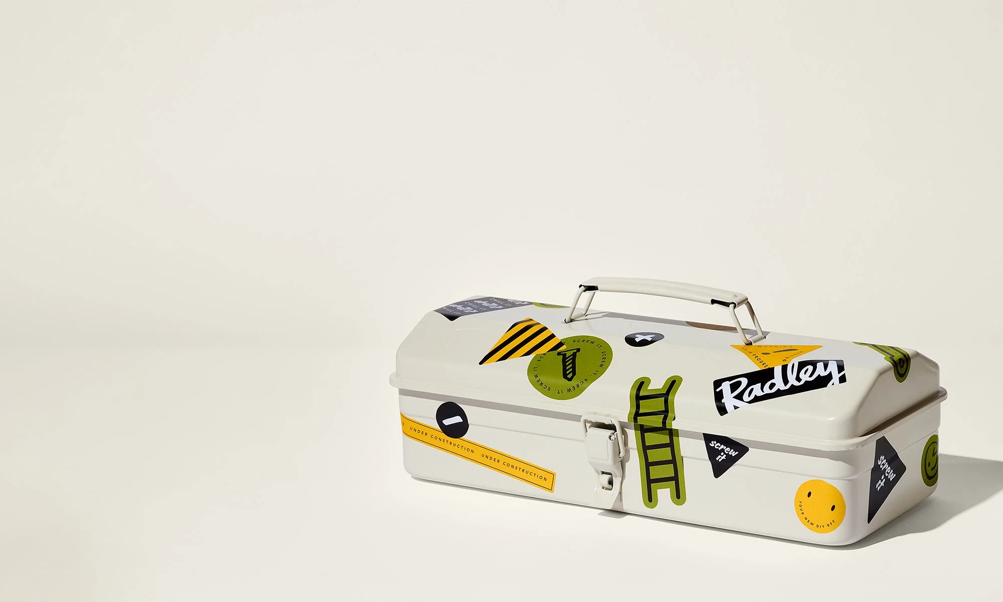
“Radley”, a name that sounded more like a person than a tool and the personality of the brand continued into the packaging. Each packaging had a custom hand-drawn typography, helpful DIY tips, injecting warmth and sincerity into the brand. And to further differentiate Radley from the “bro” crowd, a more gender neutral colour palette was chosen in a category dominated by blacks, blues and reds.
ROLE
Designer
TEAM
Agency: john st
Client: Home Hardware
Executive Design Director: Mooren Bofill
Design Director: Jacqueline Lane
Designers: Ming Mikaeo, Carol Hung
Copywriter: Liz Allemang